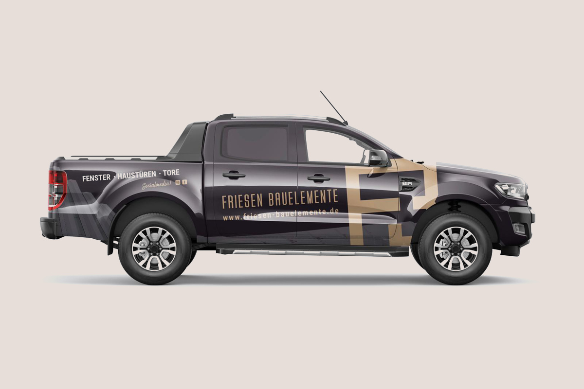
Friesen Bauelemente
The passion for planning and building
Client
Friesen Bauelemente
Role
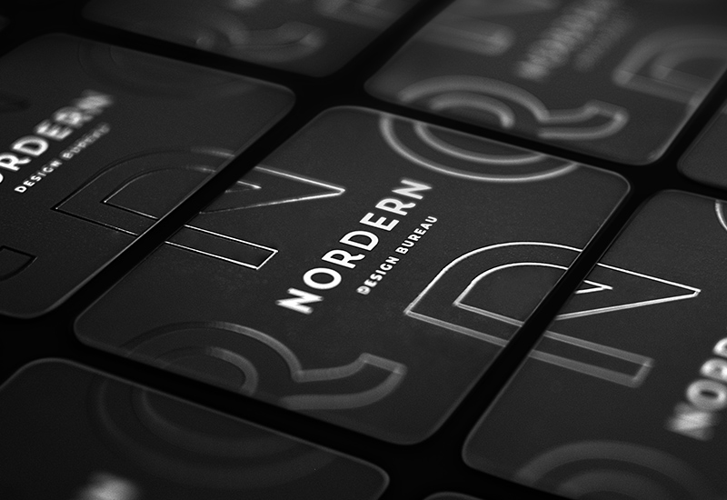
Brand Identity
The Story
Stand out from the crowd. With contrast and clarity.
How can something that is know and has been seen numerous times be highlighted in such a fresh new way that it manages to stands out once more from the noise? Simply put, give it clarity, contrast and make it shine by the less-is-more principle.
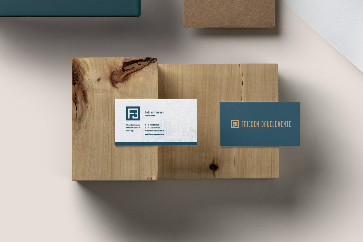
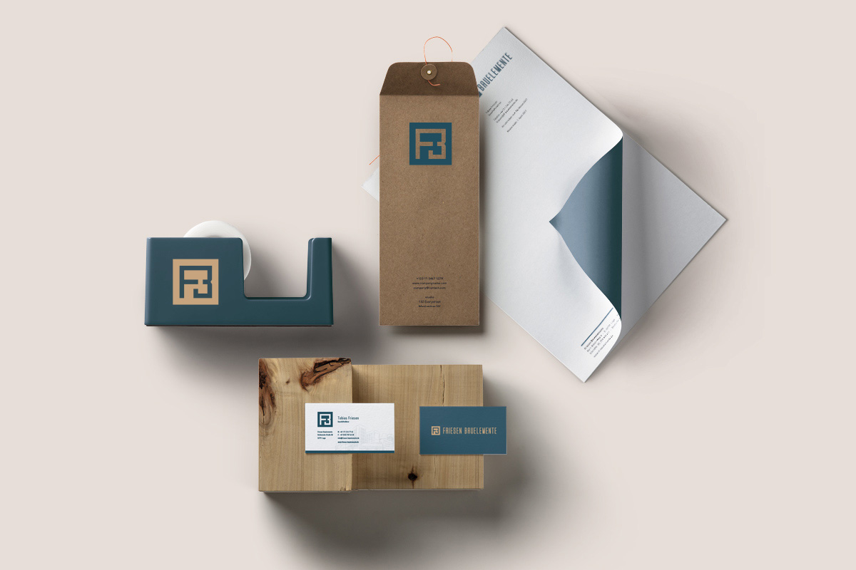
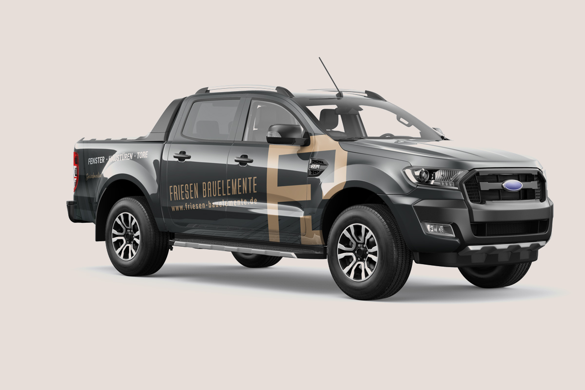
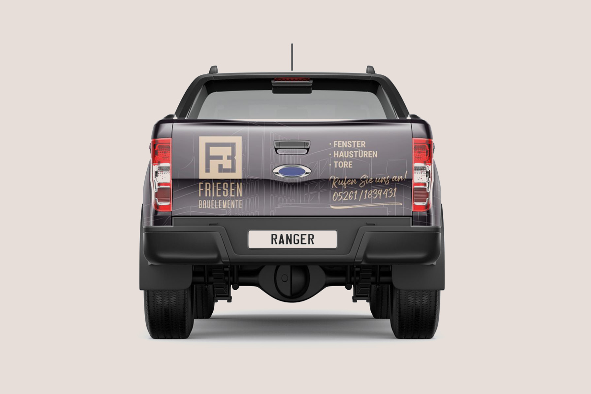
The Nordern Design Bureau created the new brand image and communication tools for the young, up-and-coming company. From logo to corporate stationary, the new brand declared a clean-cut and sophisticated era for the company.

The greatest clarity has always been the greatest beauty.
Love for the Details
“The difference between something good and something great is attention to detail”.
– Charles R Swindoll, pastor & author
It is attention to detail that can very much be the difference between a good design and a great one. This holds true and is absolutely essential in any type of design, from a simple logo to the building of a bridge. Something may look beautiful when taken at face value, but may be a whole lot less than when put under the microscope. Just like with the work of Friesen Bauelemente, a specialist in planning and implementation of window construction and all kinds of window elements in new and old buildings, such was also the approach to the new Brand created by Nordern.