heimat -
welcome home!
Developing a brand with heart and faith.
heimat Brand Development
With heart and faith.
heimat is a non-denominational free church from southern Germany. With this in mind, the new brand was moulded around the meaning of the word “Heimat”, to create a home where everyone is welcome! Our mission was clear, to portray this concept visually and use it as an anchor for the brand development and graphics that follow.

heimat (home) is something very personal and individual. Everyone associates something unique with it. As a result it was important for us to develop a brand icon that is universally recognisable and relatable to the core idea behind heimat.
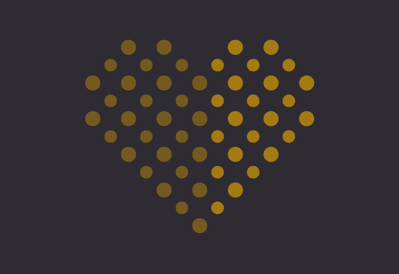
They say, “home is where the heart is”, a place where one can feel comfortable, safe and at ease. Furthermore, the symbol of the heart represents an integral part of who we are as human beings, a recognisable icon for affection across many languages and religions.
Nordern designed the heimat icon compromising of several individual dots, as a home consists not only of the individual, but also of all the individuals and the bits and pieces that make it whole. This is heimat. The non-denominational free church in southern Germany.


Gold and purple colours set the tone of the new brand identity. Reusable circular elements used in different layers make up the brand appearance.
In addition to developing the logo, we were tasked to create the brand look for heimat. The circular elements of the heart, for example, are reusable graphical elements that can be used in various forms on posters, roll-ups and much more. In addition to defining corporate colours and fonts, rollup banners were initially produced and used to announce and promote the new brand launch.