

Der Core idea
Looking at the bigger picture. Developing the new brand for Panorama Church Göppingen.
A panorama is characterised by the coverage of a broad viewing angle. On the one hand, this broad viewing angle or insight can be related to landscapes, but on the other hand it can also relate to the human aspect, seeing both the individual person, his traits and talents but also the people as a community.
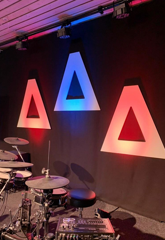
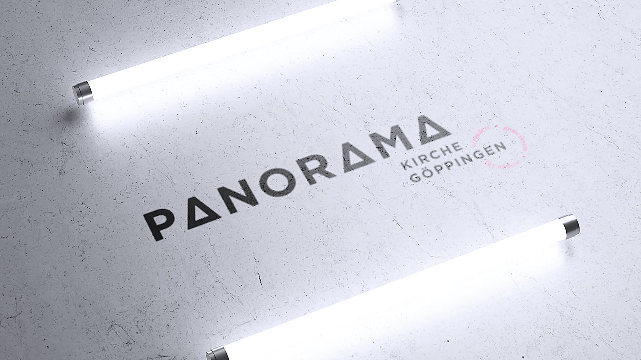
The view covering the three Kaiser Mountains is well known throughout the region of the Swabian Alb in Baden-Württemberg. The new Panorama logo consists of three “A” s which symbolise these mountains named Stuifen, Rechberg and Hohenstaufen. We use these not only in the logo but also as graphical elements in brand icons, patterns, and more to shape the new brand look.
Shaping the brand through simple means
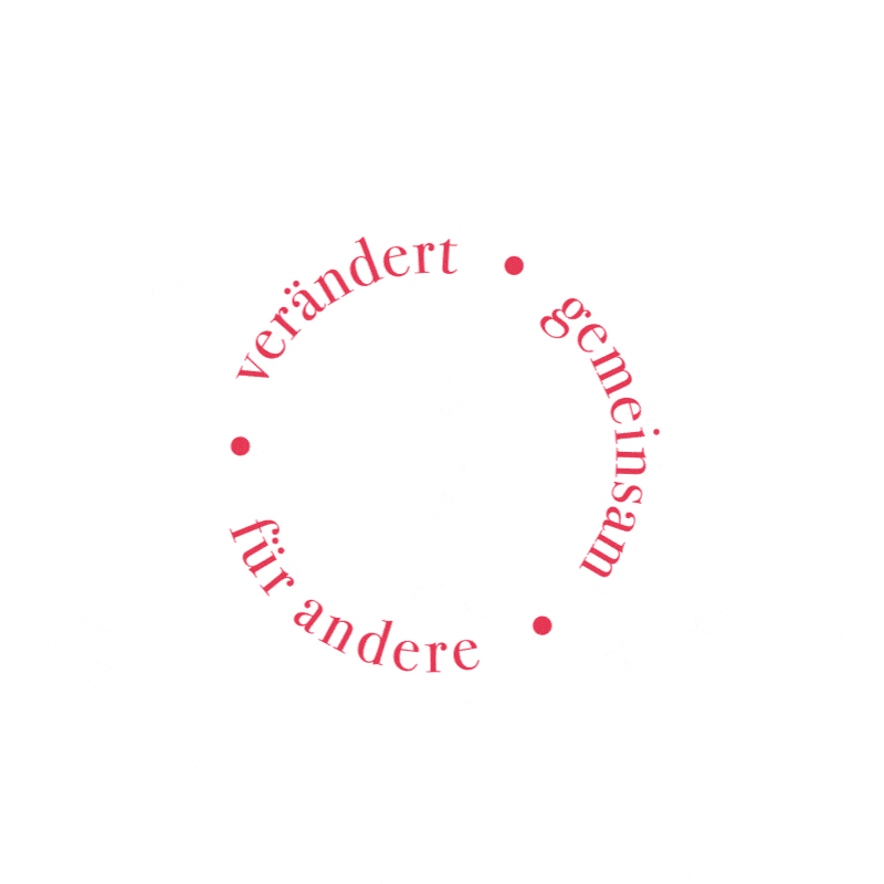
Using logo elements, a flexible graphical toolbox is created.
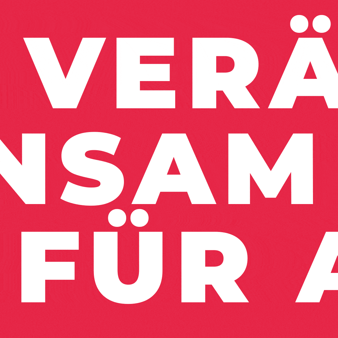
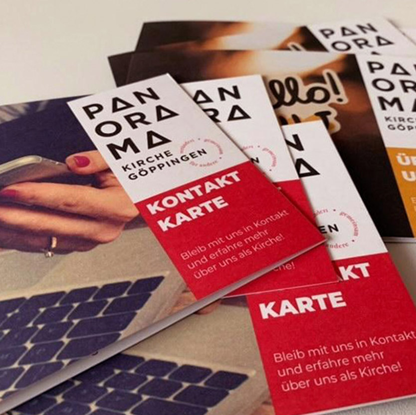
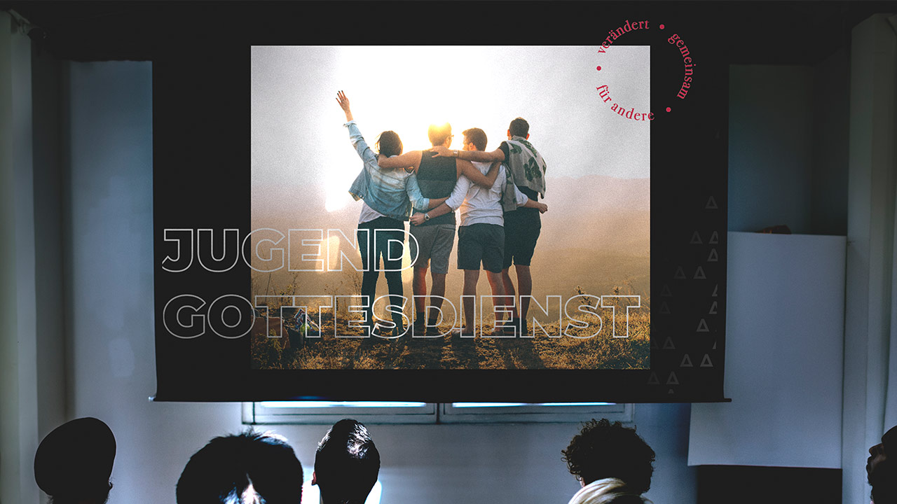
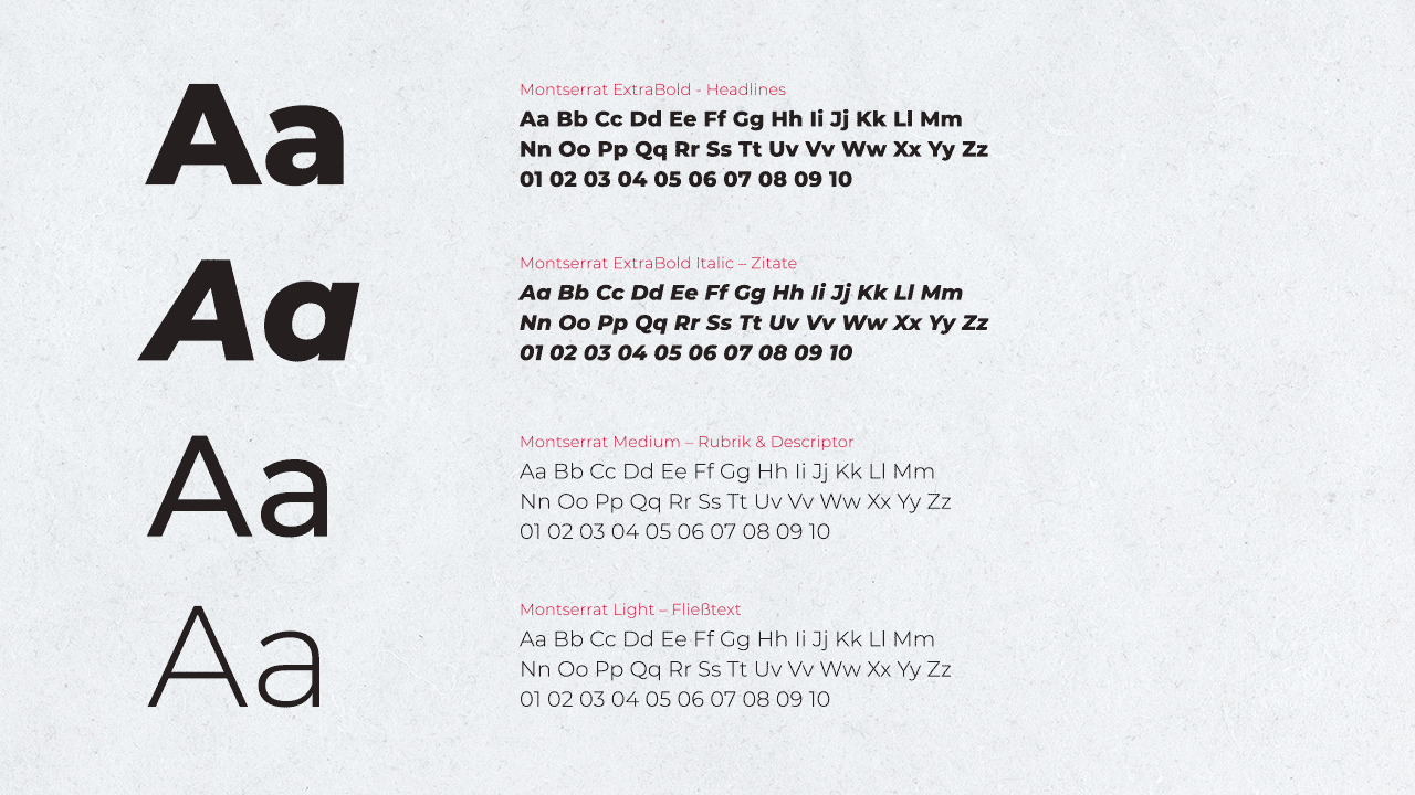
With a stacked and slim version of the logo, the new brand can be used in various print and web applications. Two colours and two font families characterise the bold visual look which can easily be adapted and expanded upon to suit various needs. With several patterns, image overlays and combinations of graphic elements, the toolkit offers a lot of freedom for exciting design constellations.

Would you like to learn more about Panorama? Then follow the Instagram channel here:
Panorama on Instagram